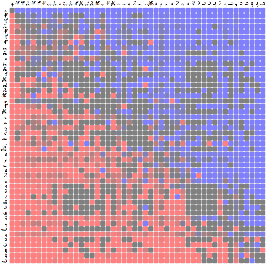
This diagram shows the relative positions of glyphs within words in the Voynich MS. A blue square indicates that top comes after left, and a red square vice versa.
It is well known that certain Voynich MS glyphs appear always in certain positions in words. The most obvious of these are 4, which always comes at the beginning of a word, and * and p, which always come at the end. In fact, in these cases the important unit appears to be the line rather than the word.
It has also been noticed that glyphs in general appear to be quite well ordered within words. This diagram is a measure of how strong that ordering is. A pure ordering would have only blue in the top right triangle (◥), and only red in the bottom left triangle (◣), a mirror image of the top right triangle. As we can see, this rule is very closely adhered to, meaning that most glyphs are in fact ordered within a word. There are, however, some notable exceptions.
For example, if you compare H to f, you will find that it gives a red square in a sea of blue, or vice versa. This means that although H tends to come later in a word than f normally does, when H and f appear together, then the H comes first. This may suggest some kind of connection between these glyphs.
"Comes before" and "comes after" are measured in a binary way, meaning that distance and number of occurrences are ignored. So for example "ab" ranks as "b-after-a" just as much as "acccbbb". The strength or dullness of the colours indicates the frequency of the beforeness or afterness. So if one glyph comes before another 100%, it will be a bright colour. As you get towards 50%, it becomes dull. It becomes bright again as it moves to 0%, because this indicates the reverse: i.e. coming before another glyph 0% of the time is the same as coming after it 100% of the time.
So dullness means that the relative positioning between the two glyphs is quite balanced, that they tend not to be strictly ordered. Bright colours indicate strong ordering. Since most of the chart is strongly coloured, most glyph combinations are strongly ordered. An example of a dull squared glyph is 9, which tends overall, as an average, to come towards the end of words. But since its squares are more dull than its surroundings, it is more "moveable" than most other glyphs. Other relatively dull squared glyphs include y and e.
In some cases we find that the glyph contains many exceptions within its squares. A good example is i, which has plenty of red in the blue side, and blue in the red side. It is clear that the ordering of the glyphs in general follows the typology of the glyphs themselves. We start with the "gallows" characters such as g, then the variations of 1, followed by variations of c and finally variations of i. But i itself comes relatively early within words overall, whilst also showing one of the greatest number of exceptions. The typological ordering isn't a strict rule, in any case, as glyphs such as 9 provide exceptions.
Glenn Claston's Voynich 101 transcription was used for the source of this analysis. A short python program was used to parse the data, which was then plotted using a CoffeeScript program and d3.js. The files and data are available:
Claston's transcription was chosen because of the high degree of granularity regarding the glyphs. No other transcription comes close to providing the same amount of detail. Only the 48 most common glyphs were used in this analysis. There are many more "rare" characters which did not, therefore, form part of this analysis. Typologically speaking, this may be a mistake. But 48 was chosen because it would have been difficult to display much more data in an easy to consume manner.
The chart is licensed under CC by-sa 4.0. The source code and data linked above are licensed under the Apache License 2.0.
The voynich-101.woff font used in this document, and in the chart, was prepared for me by David P. Kendal from the original public domain VOYNICH.TTF font by Glenn Claston. I am also very grateful for Claston's work on the font and transcription, and his commitment to place the font in the public domain. Thank you to Rene Zandbergen for feedback on the first version of this article. Credit to each of these individuals does not imply their approval or otherwise of this work.
Sean B. Palmer, June 2014